Study in Blue, part II :: Étude de bleus, partie II

I wanted to rectify my explanations that I gave on my last post on how I use and choose paint colours. As some of you seem to have understood, I do not paint the entire surface with a blue wash…

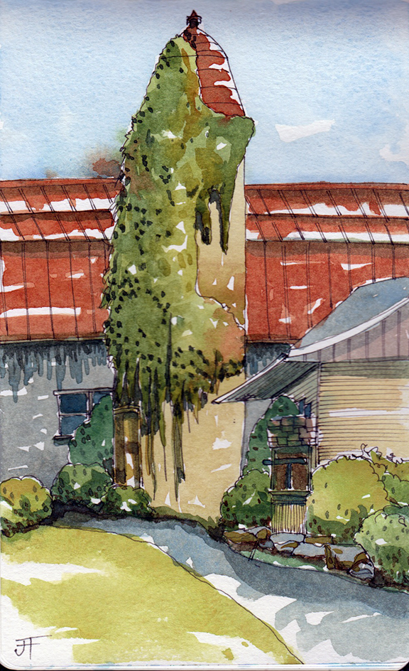
Just before starting to paint, I think about the three colours that I will use and that will best represent the scene that I have in front of me. I always start by choosing which blue that I will use to mix my colours with. Will I choose Cerulean Blue? or Cobalt Blue? or French Ultramarine? or Prussian Blue? Each blue gives very different atmospheres… In my humble opinion, Cerulean Blue gives a very soft atmosphere while French Ultramarine Blue gives drama, and Prussian Blue gives a very lively and summery atmosphere and Cobalt Blue is perfect for summer and winter (well, to me anyway). The reason that I start thinking about the colour blue is that once I have made my decision, then this will also direct my choice for the two other primary colours… red and yellow or something else. I hope that this clarifies things. For my next paintings, I will be rotating and moving through all of the blues that I have and that will give you a better idea of my explanation.

J’aimerais rectifier l’explication de mon blogue antérieur car il y a une couple de personnes qui ont compris que j’avais utilisé un lavis de bleu sur ma peinture au complet… et ce n’est pas le cas.

Quand je regarde une scène pour peindre, je pense premièrement aux trois couleurs que je vais mélanger pour représenter l’atmosphère de la scène. La première couleur à laquelle je réfléchis est le bleu… est-ce que je vais utiliser le blue céruléen? ou le bleu cobalt? ou même le bleu ultramarin? ou le bleu de Prusse? car chaque bleu va donner un thème différent à ma peinture. Je trouve, à mon humble avis, que le bleu céruléen est très aérien et léger et doux tandis que le bleu ultramarin est dramatique, et le bleu cobalt est parfait pour l’été et l’hiver tandis que le bleu de Prusse donne une gaieté estivale qui est incroyable! Ceci n’est pas une science mais des impressions que j’ai à force de mélanger et de peindre… Une fois que j’ai choisi le bleu que je veux, ensuite vient le choix plus facile du jaune et du rouge ou un autre… j’espère que ceci a éclairé un peu mon explication précédente… Mes prochaines peintures vont réfléter mon explication ici car je vais changer de bleu et faire le tour de tous les bleus que j’ai -)

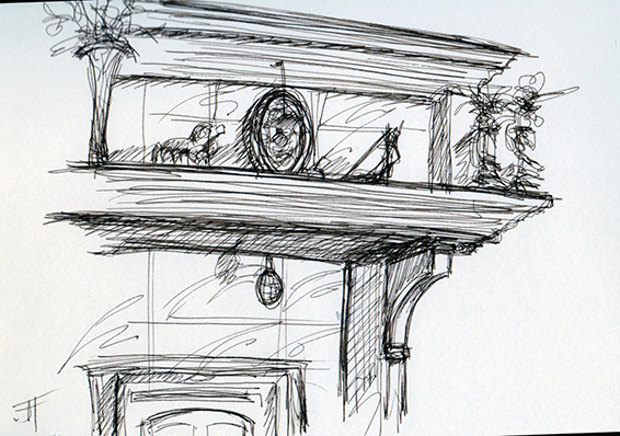
Paper: Larolan Sketchbook #10 – 5″ x 8″
Pen: Pilon FlexiGrip EF
Ink: Noodlers Lexington Grey
Colours: Cobalt Blue, Burnt Sienna and Aureolin Yellow

20130930_SynAgri

Blue atmosphere :: Le bleu et l’atmosphère

Just before starting to paint, I think about the 3 colours that I will use and I always start with the blue… I find that this is “the”colour that determines alot of the atmosphere in a painting. Today, by choosing Cerulean Blue, I knew that my painting would look very soft and pastel-like.. and that is what I wanted. However, I also knew that I would not have very deep darks, but that comes with the choice. You will tell me: “Heck Jane, why don’t you just add another blue to the combo?”. For many reasons as it seems to go against my design knowledge. In design, you usually need three main colours. If you use more, it often turns out “kitsch” and that is fine, if that is what you want. So I tend to stick to my guns, and only use 3 primary colours. One of these days, I want to try 3 secondary colours… that would be kind of cool too! This is the Veteran’s Hospital in Ste-Anne-de-Bellevue, Québec, Canada.

Quand je commence à peindre, je choisis toujours le bleu pour la première couleur car c’est cette couleur qui détermine le plus l’atmosphère de la peinture… elle a beaucoup d’influence -) Donc aujourd’hui en choisissant le Bleu céruléen, je savais que ma peinture serait douce et comme des pastels. Voici l’Hôpital des vétérans, à Sainte-Anne-de-Bellevue, Québec, Canada.

Paper: Larolan Sketchbook#10 – 5″ x 8″
Ink: Noodlers Lexington Grey
Pen: Pilon FlexiGrip EF
Colours: Cerulean Blue, Raw Sienna and Burnt Sienna

20130928_VeteranHospital

La maison des grands vents et du clair de lune

I just wanted to share with you a poem that one of our neighbours (who was a good friend of my parents) wrote for us when we had newly arrived at our house. It is in French, and for English people, you might get some words but I wish that you could comprehend the beauty of it.

I am posting this poem because of the hot peppers… Marie loved hot peppers, as she also loved going on her bike to pick up wild flowers. Her name was Marie Dionne and she was a great artist… everything that she touched turned to gold… when she died she left behind many children and a loving husband. So this is in dedication to her… she wrote this poem on the night of my 35th birthday -)

Oh! Maman!
Plus rien n’est comment avant
La maison d’à côté
Vient de jouer son dernier dé

Nouveau voisin
Comme belle grappe de raisins
Il s’agit d’un jeune couple
Au petit bonheur devant sa soupe

Le boisé saura les protéger
En veillant sur leur intimité
Sans jouer au curé
Il faut profiter des grands prés

Ici, la nature est généreuse
On oublie la ville et le rossignol rend amoureuse

L’horloge ne compte pas les heures
Et le soleil te donne toutes ses heures
À leur manière, les saisons
T’offrent des frissons

Tu seras surprise de la table toujours mise
Sincère amité à prendre avec doigté

Il y aura, à l’occasion, dans la maison
Père, mère, fille et garçon
Place à la surprise
Ce sera toujours de mise

Les objets deviendront familiers
Toujours plus beaux à la lueur des chandeliers

Oui, ma mie, jaurai voisine
Qui est la fille d’une copine

J’entends la tourterelle trise
Certains jours ça existe…
Par contre, l’hirondelle
Toute heureuse, bat des ailes

Durant la nuit, la chambre close
Protège les amoureux qui reposent
Au petit matin
Grande nappe, petit festin

Écoutant respirer, toute moite
La maison maladroite
Car elle accueille à nouveau
Des gens dont elle ne connaît pas l’odeur de la peau

Le parfum des fleurs
À l’été, donnera des couleurs
Les maîtres de la maison
Auront de tout nouveaux horizons

Avec souvenirs, veillera en paix
Arrêtant le temps si elle le pouvait…
De l’ennui, Dame Nature allège les tracas

Et le vent, dans sa douce voix
Laisse passer le bonheur entre ses doigts

Et d’un duvet doux
La brise répète cachez-vous, c’est pour vous

Rappelant que les couples heureux
Font de l’ombre aux envieux…

Paper: Hand•Book Journal, 5.5″ x 5.5″
Ink: Noodlers Lexington Grey
Fountain Pen: Pilot FlexiGrip EF
Colours: French Ultramarine, Alizarin Crimson & Aureolin Yellow

20130926_HotPeppers


Restating Exercise

I just wanted to mention that I have amazing students this year, for both of the courses that I teach in first and second year in our Publication Design & Hypermedia program. This is a three year program at CÉGEP level (between high school and university in Québec) where students graduate with amazing competencies — web design for mobile apps such as iPhones/Androids, tablets and desktops, html, css, javascript, Epubs, WordPress, web design, print design, typography, photography, some animation, how to setup their own business, how to work in teams, and how to work on themselves also.

Some of our students struggle and some just swim through it, as if they were born to do this. They have several shows such as the Trade Fair and also a Vernissage at the end of their three years. However I wanted to mention today that our present cohorts are just totally amazing… they are nice, thoughtful and intelligent persons which makes it a pleasure to teach.

They also learn how to sketch — which I am extremely honoured of helping them out… from thumbnails for design purposes in the creative process, how to look at composition, tonal values, perspective drawing, how to communicate through the use of drawing… and some of them are sketching like crazy and for some, it is arduous. But they are doing it! So proud of them!!! So this restating sketch is dedicated to them, to entice them into “just doing it” and stop thinking about it (where the anguish sets in). This took about 10 minutes and I used the restating technique.

Je me sens bien privilégiée d’enseigner de si bons élèves — et ils sont bons à cause qu’ils sont intelligents, gentils, motivés et ils veulent apprendre ce qu’on leur enseigne. Ça fait tellement de bien pour un enseignant d’avoir ce type d’élève!

J’enseigne dans un programme au niveau collégial “Cégep” (qui est entre l’école secondaire et l’université) qui se nomme “Publication Design & Hypermedia” où ils apprennent le design web pour les applications mobiles comme les iPhones/Androids, tablettes et desktops, html, css, javascript, Epubs, WordPress, le design pour l’impression, la typographie, la photographie, une base d’animation, comment partir leur propre compagnie, comment travailler en équipe, et aussi travailler sur eux-mêmes. Certains de nos élèves sont comme un poisson dans l’eau dans notre programme, et d’autres rencontrent des difficultés. Mais ils apprenent pleins de choses, et c’est toujours très émouvant de les voir entrer quand ils ont 16-17 ans et les voir partir 3 ans plus tard, matures et prêts à entrer dans le monde adulte. Beaucoup continuent leurs études à l’université.

Une des choses dont je suis le plus fière est le fait que mes élèves apprennent à dessiner — des croquis, des esquisses, des valeurs de tonalité, la perspective, différentes techniques de dessin et certains élèves encore sont comme des poissons dans l’eau et d’autres, rencontrent des embuches mais persévèrent. Je suis extrêmement fière d’eux et je leur souhaite une très belle journée! 

Paper: Moleskine Sketchbook
Ink: Noodlers Lexington Grey
Fountain Pen: Pilot FlexiGrip EF
20130913_restatingExercise

For whom the bell tolls :: Pour qui sonne le glas

This is a beautifully maintained church where the parishioners of St-Louis-de-Gonzague seem very proud of. The bells of the church are still tolled by hand, like in the old times.

No, I will not be talking about Ernest Hemingway’s book today. I will talk about what dawned on me this morning. I realized today that when I really look hard at the landscape that I wish to paint, and also think hard about my colour combination before I start painting, I succeed in painting something that makes sense and is at least acceptable. Today the sky was greyish and that greyness gave some muted tones to the objects… so I decided to use three soft colours (not hard edged). Let me know how you start your painting? Do you think about the composition first? The grey values? The colour combos? Or do you just plunge into it head first, and hope for the best like I used to do before and sometimes still do?

Voici une église qui est remarquablement bien entretenue, et où ses résidents semblent très fiers. Saviez-vous qu’il y a encore un bedeau qui fait sonner les cloches à l’aide de cordes? Comme dans le vieux temps?

Non, je ne parlerai pas du livre de Ernest Hemingway (qui est excellent en passant) mais bien d’une idée avec laquelle je me suis réveillée ce matin. J’ai réalisé ce matin que si je regarde très fort un paysage, et que je réfléchis beaucoup sur les couleurs que je devrais utiliser, habituellement les résultats sont pas si pires. Donc ce matin j’ai pensé fort et j’ai décidé qu’étant donné que c’était une journée grise, mes trois couleurs devraient être plus douces, pas trop franches. Quand vous décidez de peindre, quelle est votre première étape? Des petits croquis pour les valeurs de gris? Un croquis de composition? Réflection sur la combinaison de couleurs? Ou est-ce que vous plongez la tête la première et espérez pour le mieux, comme j’ai dû faire des centaines de fois? 

Paper: Moleskine Watercolour Sketchbook
Ink: Noodlers Lexington Grey
Fountain Pen: Pilot FlexiGrip EF
Colours: Aureolin Yellow, Rose Madder Genuine and Cobalt Blue

20130922_StLouisDeGonzague_Church

Things from the past :: Ces choses du passé

I would never have guessed that painting would have shown me what I truly love… I had not realized that I love old barns as much as I do. I think that in general I like old stuff as my house is filled with miscellaneous items that go way back in the past, in remembrance of those who have passed or because of their historical or genealogical significance… sometimes simply because of their beauty. Nowadays I find that old barns, and old houses are disappearing at an alarming rate and being replaced by clapboard. Yikes!

I have been using alot of Aureolin Yellow lately as I find that this is about the only yellow that I have that does not muddy my greens… New Gambodge has a red undertone, and muddies my greens… and the other yellow that I have is Cadmium Yellow Light, which is opaque, and have not played with it enough for me to comment. Is there another yellow that you would recommend?

Je ne savais pas que la peinture était pour me montrer que j’aime les vieilles granges… de toutes sortes. Heu! Je pourrais dire qu’en général j’aime les veilles choses, pour le souvenir qu’ils me rapportent pour ceux que j’ai aimés ou bien pour leur valeur historique ou généalogique ou simplement à cause de leur beauté. Pour mes dernières peintures, j’ai utilisé le Aureolin Yellow car il fait de très beaux verts… à comparer du New Gambodge qui a des sous-tons de rouge qui brouillent les verts, et aussi le Cadmium Yellow Light, mais étant donné qu’il est opaque, et que j’aime la transparence dans mes peintures, je ne l’utilise pas. Avez-vous une couleur jaune que vous utilisez fréquemment que vous aimez?

Paper: Moleskine Watercolour Sketchbook
Ink: Noodlers Lexington Grey
Fountain Pen: Pilot FlexiGrip EF
Colours: Burnt Sienna, Indigo and Aureolin Yellow

20130920_OldBarn

What a day :: Quelle journée

After a full and frazzled day, I decided to soothe my soul and go to St-Louis-de-Gonzague with Pyper in tow (for those of you who do not know, he is my dog, a Golden Retriever). I love autumn as the trees are still full of leaves, they are starting to have a tinge of orange and yellow and the shadows are long… which I love! I saw this cute old house with the huge silos in the back of it, and couldn’t resist them…

Après une longue journée éreintante, j’ai décidé de prendre la route vers St-Louis-de-Gonzague avec Pyper dans le siège arrière. L’automne qui arrive avec ses arbres pleins de feuilles, tournat au jaune et orange avec ses ombres longs, j’adore! Quand j’ai vu cette petite maison avec ses silos monstres, je n’ai pu résister.

Paper: Moleskine Watercolour Sketchbook #9
Ink: Noodlers Lexington Grey
Fountain Pen: Pilot FlexiGrip EF
Colours: Quinachridone Burnt Orange, Cobalt Blue and Aureolin Yellow

20130919_OldHouseSilos

Restaurant Casseau Blanc Restaurant

A pencil drawing at the Restaurant Casseau Blanc in Valleyfield. I do not know why, but I am not very attracted to pencil drawings… I guess that it is because I have never done much of these. So I am giving them a try, to see how it goes… This was done in the Hand•book Sketchbook which the Avenue des Arts owner gave me, and I truly appreciate it… it’s quality is very good.

Un dessin au crayon graphite… je ne sais pas pourquoi, mais je ne suis pas beaucoup attirée par les crayons graphite — peut-être à cause que j’en ai fait très peu? Donc je me pousse à en faire et à expérimenter, pour au moins mieux comprendre ce médium, qui pour certains, semble exquis!  Ceci a été dessiné dans un Hand•book Sketchbook que le propriétaire du magasind d’arts Avenue des Arts m’a donné et que j’apprécie beaucoup.

Sketchbook: Handbook Landscape
Pencil: Graphite 2B
20130918_CasseauBlanc

Old Silo :: Vieux silo à grains

This is in the beautiful, quaint village of St-Louis-de-Gonzague where my father was buried. There are still quite a few old farm silos and this is one of them… all entwined in vines. I am pretty happy with this painting — which in itself is a rare feat as I am usually quite critical of my paintings –)

Peinture à partir du pittoresque petit village de St-Louis-de-Gonzague où mon père fut enterré. Il y a encore de très vieux silos de fermes dans cette région, tout emmitoufflé de vignes.

Paper: Moleskine Watercolor Sketchbook #9
Ink: Noodlers Lexington Grey
Fountain Pen: Pilot FlexiGrip EF
Colours: Quinachridone Burnt Orange, Cobalt Blue and Aureolin Yellow with a tad of Burnt Umber
20130916_StLouisDeGonzague

St-Louis-de-Gonzague Procession

It felt good to see the water today and to see all of these boats before they are put on trailers for their winter hibernation. In Canada, the lakes freeze and we can take our cars, or our feet, to walk on them -) There are cities, such as Valleyfield and Hudson, where there are ice-roads or ice-bridges (as they are sometimes called) with traffic signs on them -))) Another moment today was going to the procession with my Mom and Pauline for Dad’s passing away in St. Louis de Gonzague… a very quaint and neat village. Many villagers turned up for the procession and we walked to the cemetery afterwards… it was nice to just meet up and walk together.

I am trying to find a good bag to carry my watercolour paraphernalia with me in my car and elsewhere… do any of you know of a bag that would fit the following criteria?
• a water bottle, preferably two;
• several small pockets for different items;
• a place to put a 9 x 12 inch block of watercolor paper with protection from the weather?• With only one flip cover?
• With outside pockets to store stuff too?

At the moment I am using the Nomadic Walker which is almost perfect! However, it has so many flip covers going in many directions that I tend to forget what is where? Anyway, let me know if you have a favourite bag for carrying your watercolour accoutrements -)

Bientôt ces bateaux vont être remorqué et mis en hibernation pour l’hiver — car ici au Canada — les lacs gèlent et on peut, en fait, marcher sur les cours d’eau et parfois prendre l’auto à certains endroits et se promener dessus ou se rendre à d’autres destinations. Plusieurs villages et villes ouvrent des ponts de glace  avec des panneaux de signalisation et c’est assez trippant de se promener de cette façon. Tout près d’ici, à Hudson il y a un très long pont de glace entre Hudson et Oka et la promenade est extrêmement agréable. Coup donc, est-ce que j’aurais hâte à l’hiver? Ça se peut bien -)))

Aujourd’hui avec ma mère et Pauline nous sommes allées à la procession pour mon père à St-Louis-de-Gonzague. La procession est pour les personnes qui sont enterrées à cet endroit. C’est surprenant comment il y avait beaucoup de monde et c’était assez apaisant de marcher ensemble vers le cimetière pour revoir mon père et mettre ma main sur son tombeau. Je comprends ma mère quand elle dit que c’est un beau cimetière — c’est vrai!

Paper: Moleskine Watercolor
Pen: Pigma Micron Pen 01
Colours: Aureolin Yellow, Cobalt Blue and Alizarin Crimson

20130915_YachtClub