Montreal Vue :: Vue de Montréal

Yesterday the Urban Sketchers and I were at the Montreal Museum of Fine Arts MFA, and I went to the Stewart Building on the 4th floor to visit the Inuit exhibit… and the view coming out of the elevator was breathtaking, especially for a country girl where rarely do I have skyscraper views — my views are of the forest and of old farm buildlings. So here it is. This view is looking northwest. I drew everything there and then put in the colours at my house as I did not have the time to finish it off.

Hier avec les Sketchers urbains de Montréal nous sommes allés au Musée des Beaux Arts MBA et je me suis dirigée vers le pavillon Stewart qui loge l’exhibition Inuit. Cette vue est en sortant de l’ascenceur au 4e étage… pour une fille de campagne, les vues de gratte-ciel sont excitantes et différentes d’un paysage forestier ou de campagne. Cette vue est en regardant vers le nord-ouest.

20130128_MFA

Bust of Empress Joséphine :: Buste de l’impératrice Joséphine

Today the Montreal Urban Sketchers went to the Montreal Museum of Fine Arts. I went to the Desmarais Pavilion to see the temporary Napoléon I Gallery. This terracotta sculpture was created by Joseph Chinard in 1805 in Lyon, who was considered the most discriminating portraitist of his day. I find that my version has a comic-book rendering to it which does not reflect the actual sculpture. I am not used to drawing portraits… so I need practice!

Aujourd’hui les Sketchers urbains de Montréal se sont regroupés au Musée des Beaux-Arts de Montréal. Je suis allée au pavillon Desmarais pour voir l’exposition temporaire de Napoléon I. Cette terre cuite a été créée par Joseph Chinard en 1805 à Lyon, qui était considéré en son temps comme le portraitiste le plus raffiné. Mon portrait est plus caricatural et ne reflète pas réellement la finesse de la sculpture… car je ne suis pas habituée de dessiner des portraits. J’ai besoin de pratique!

20130127_JosephineBust


Banana Day & Paper Tryouts

I really struggled with my bananas today as I had to sketch them four times in order to get one that was satisfactory. The first one that I sketched was on Arches paper, which was the first time for me, so I needed some adapting to the paper. Then my second sketch was on Fabriano, another adjustment. My third and fourth ones were on Bockingford paper. I do not know which one I liked best up to now, but I think that the Fabriano went very well. The only reason that I used so many different types of paper was because these are the only ones that I have. A new discovery for me… New Gambodge is “the” banana colour. I really like it when I can identify a colour to something that is real… so now I know. New Gambodge=Bananas ;-)

J’ai réussi cette peinture au bout de quatre essais sur différentes sortes de papier. Ma première peinture de bananes a été fait sur du paper Arches, ma deuxième sur du Fabriano et mes deux dernières sur du Bockingford. Je crois que j’ai préféré le Fabriano, mais je ne suis pas certaine. Une chose que j’ai aimé découvrir est que la couleur New Gambodge est la couleur des bananes. J’aime bien quand je suis capable d’associer quelque chose de concret avec une couleur. Donc New Gambodge=Bananes ;-)

Paper: Bockingford 130 lbs
Watercolours: Winsor & Newton, Daniel Smith
Colours: New Gambodge, Aureolin Yellow, Burnt Umber, Serpentine Green  and French Ultramarine

20130126_banana

Baby it’s cold outside :: Y fait frette dehors

Throughout the province of Quebec, the temperature is hovering around -20°C and they are announcing -26°C for tomorrow and on Thursday…. brrrrrrr! Actually it’s really not that bad as it is a dry cold instead of a humid cold. So here is part of the Old Farm building next to John Abbott College on the MacDonald Campus. This building is home to the Canadian Aviation Heritage Center and is well worth the visit… all kinds of old planes have been brought back to life and which would be very cool to paint on one of these days. Its mandate is to restore aircraft that have marked the Canadian aviation history.

Y fait frette dehors! Avec des températures qui oscillent entre -20°C et -26°C pour demain, on marche vite de ce temps-ci. Voici le bâtiment Vieille Ferme sur le campus MacDonald juste à côté du Cégep John Abbott. Ce bâtiment abrite le Centre canadien du patrimoine aéronautique et le musée vaut le détour car il y a plein d’avions qui ont été restaurés qui seraient pas mal cool de peindre une de ces bonnes journées. Son mandat est de restorer les avions qui ont marqué l’histoire aéronautique canadienne.

Paper: Larolan Watercolor Sketchbook
Watercolours: Daniel Smith / Winsor & Newton / Schminke
Colors: Cerulean Blue Tone / Burnt Sienna / Raw Sienna / French Ultramarine /
Pen: Pilot Flexi Grip Fountain Pen EF
Ink: Noodlers Lexington Grey

20130122_ColdOutside

Mary Queen of the World Cathedral :: Basilique Cathédrale Marie-Reine du Monde

Today about 16 people regrouped for the Montreal Sketchcrawl. This cathedral took 17 years to build, from 1870 to 1878 and the second phase, from 1885 to 1894… and the beautiful dome was finished in 1886 and is Quebec’s third largest church. In that same year, the cross was installed weighing a total of 1,600 lbs and measuring 18 feet high. In Montreal, this was the first building to have cost over 1 million dollars and it was also the tallest at that time. This was the only basilica that replicated the Basilica of St. Peter in Rome.

Environ 16 personnes se sont regroupées aujourd’hui pour le Sketchcrawl de Montréal. J’ai décidé de peindre la Basilique-Cathédrale Marie-Reine du Monde qui se situe juste en face de l’Atrium au 1000 de la Gauchetière. Cette imposante structure pris 17 ans à bâtir et a été inaugurée en 1894… et son dôme majestueux recevra sa croix qui mesure 18 pieds et pèse 1600 livres. À Montréal, dans ces années-là, elle coûta plus d’un million de dollars et était la plus haute bâtisse dans tout Montréal. Elle était la seule réplique de la Basilique St-Pierre de Rome.

Paper: Larolan Watercolor Sketchbook
Watercolours: Daniel Smith / Winsor & Newton
Colors: Mayan Blue, Burnt Umber, Mayan Violet, New Gambodge, French Ultramarine
Pen: Pilot Flexi Grip Fountain Pen EF
Ink: Noodlers Lexington Grey

20130119_MarieReineDuMonde


Colours in my Eyes :: Couleurs dans mes yeux

As I mentioned yesterday, once I stop painting, even for a few days, my colours are not synchronized with my painting. So I find that whenever I am in this situation, this type of exercise really helps to bring back the colours in my eyes. So for the right hand side of the page I chose to use two of my favourite yellows which Aureolin Yellow (W&N) and New Gambodge (DS) and combine them with my favourite blues… in order to give me the greens that I really long for but quite often get a murky green instead of the green that I would like. So my blues were Cerulean Blue (DS), Cobalt Blue (DS), French Ultramarine (DS) and Cerulean Blue Tone (Schminke). This really helps me to see my colours as I am getting for tomorrow’s Sketchcrawl. For the left hand side of the page I chose two of my favourite reds, which are Alizarin Crimson (DS) and Mayan Violet (DS) and mixed them with the same blues as above to give me purples (I am thinking of the snow themes at the moment as I live in a norther climate).

Pour me remettre les couleurs dans mes yeux, j’ai décidé de faire ce petit exercise qui est en soi assez stimulant. J’ai choisi pour la page de droite mes deux jaunes préférés, Aureolin Yellow (DS) et New Gambodge (DS) et les mélanger avec mes bleus préférés qui sont Cerulean Blue (DS), Cobalt Blue (DS), French Ultramarine (DS) et Cerulean Blue Tone (Schminke) pour essayer de trouver les verts que je recherche et que trop souvent revirent sombres et obscurs. Pour la page de gauche j’ai choisi mes deux rouges préférés, Alizarin Crimson (DS) et Mayan Violet (DS) pour me donner les tons de violet-mauve qui sont si désirés pour notre belle neige. Donc voici l’exercice tout frais.

Paper: Larolan Watercolour Sketchbook
Watercolours: Daniel Smith / Winsor & Newton / Schminke
20130118_Colours

My Street in Rigaud :: Ma rue à Rigaud

I have not been able to paint at all this week as my life, all of a sudden, turned quite hectic and topsy-turvy . So usually, after a hiatus of a few days, I lose all my painting senses… observation, hand coordination, colour combinations… as though I lose touch of being in the moment with the act of painting. In one of Joni Mitchell’s songs she says it so perfectly: “I live in a box of paints” … when you are in sync, it is pure joy. Well… I will probably be very joyful tomorrow! Hopefully anyway ;-)

Just to let you know that the 38th Sketchcrawl is happening in Montreal this coming Saturday and I will be there… and many other people will be there also. This event will be taking place at the Atrium of 1000 de la Gauchetière and we will meet around 9:30 a.m. Hope to see you there ;-)

Cette semaine ma vie a revié de bord-en-bord… tout d’un coup, j’avais tellement d’engagements, de rendez-vous, de réunions que j’ai dû délaisser ma peinture pour un moment. Et comme d’habitude, quand je reviens d’un lapse de temps où je n’ai pas peint, mes yeux, la coordination de mes mains, l’évaluation des couleurs semblent tellement plus difficile. Donc aujourd’hui c’était ainsi, et je souhaite que demain va être mieux ;-) 

Ce samedi, le 19 janvier 2013 est le 38e Scketchcrawl à Montréal. Ceci est un événement qui est international… des milliers de personnes se regroupent autour de la planète pour peindre tout ce qu’ils voient pendant une journée entière! De Tokyo à Sydney à Buenos Aires à Montréal, nous allons nous retrouver pour peindre ou dessiner ensemble (et même ceux qui ne veulent pas peindre peuvent simplement nous regarder). Le rendez-vous est a 9:30 am au 1000 De La Gauchetière. Tous sont les bienvenus ;-)

Paper: Larolan Watercolor Sketchbook
Watercolours: Daniel Smith / Winsor & Newton
20130117_MyStreet

Grey Misty Day :: Journée grise et brumeuse

Today was a typical grey and misty January day… and on these days, to curl up and read a good book is heaven. I had difficulty painting this scene as the sky and the snow were grey, so this is a very muted palette. I chose this point of view because of the two Bell telephone booths and the amazing Hydro Quebec power pole… there are three transformers on one pole with so many lines criss-crossing each other that it ends up looking like a maze in the sky (the song “Lucy in the Sky with Diamonds” just popped into my head). This painting was done at the Shell gas station in Rigaud, looking eastwards.

Journée grise et brumeuse, parfaite pour se blottir dans un fauteuil à ailes et lire un bon livre. J’ai eu des difficultés à peindre cette scène car le ciel et la neige étaient gris, donc des tons étouffés. J’ai choisi ce point de vue à cause des cabines téléphoniques de Bell et à cause du poteau d’Hydro-Québec qui avait trois transformeurs en plus d’un labyrinthe de câbles qui survolaient dans tous les sens. Cette peinture a été faite à la station de gaz Shell à Rigaud, en regardant vers l’est.

Paper: Larolan Watercolor Sketchbook
Watercolours: Daniel Smith / Winsor & Newton
Colors: Cobalt Blue, Burnt Sienna, Burnt Umber, Aureolin Yellow and Alizarin Crimson
Pen: Pilot Flexi Grip Fountain Pen EF
Ink: Noodlers Lexington Grey

20130112_shellStationRigaud

Near disaster :: Catastrophe évitée

A disaster happened today… as usual I left the house and had a few chores to do before leaving so I quickly filled up my water bottle and put my watercolour bag over my shoulder. I arrived at my appointment, and coming back to the car afterwards decided to sketch what was in front of me… I opened the bag, and everything was soaked through… including my watercolour sketchbook. I yelped! I quickly opened my sketchbook to look at the disaster… and because Larolan sketchbooks are of very high quality, no damage was done… all of my watercolour sketches were intact. Only the spine of the sketchbook was soaked. Fiou! So Larolan should be very proud of their sketchbooks that they actually stitch by hand in Portugal. Here is their link. It is also one of the most wonderful papers that I have ever sketched on. So here is yesterday’s rendering of the value sketch, in colour.

Une catastrophe est arrivée aujourd’hui. Je suis partie pour un rendez-vous ce matin et j’ai rempli le goblet d’eau en partant. En revenant à l’automobile, j’ai décidé de dessiner ce qu’il y avait en face de moi, donc j’ouvre mon sac à aquarelles… et désastre! Tout était trempé!!! Vous savez que si une douche d’eau tombe sur une aquarelle, la peinture disparait… le pourquoi d’une vitre quand on fait cadrer. Pour revenir à mon histoire, après avoir lâché un cri d’horreur, j’ai ouvert mon cahier et tous mes peintures étaient intactes — merci Larolan! Larolan est une compagnie qui fabrique les cahiers d’aquarelle à la main au Portugal… voici leur lien. Ils font du papier de très haute qualité, et ils ne chargent que 9$ pour la livraison, bien moins cher que d’acheter aux États-Unis. Donc voici la peinture que j’ai débuté hier, en couleurs.

Paper: Bockingford Cold Pressed quarter sheet
Watercolours: Daniel Smith / Winsor & Newton
Colors: Cobalt Blue, Burnt Orange, Burnt Sienna, New Gambodge
Pen: Pilot Flexi Grip Fountain Pen EF
Ink: Noodlers Lexington Grey

20130108_JACHouse

Value Sketching :: Étude de tons

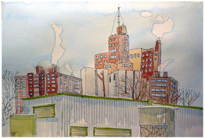
I had to go in to work today and as I was already on campus, I decided to paint one of the houses of the McDonald Campus in Ste. Anne de Bellevue. As I have been trying to draw directly, without the help of a pencil, I really messed up the perspective. So instead of trashing this drawing, I decided to make the best of it and do a value sketch (look at the tonal values). I used French Ultramarine as the only color to do this with, but I should have probably used Payne’s Grey or even Cameo Black as the French Ultramarine is a color that is too clean and I would have needed a dirtier color. I will explain the difference between these two in another post. A value sketch shows the midtones, highlights and shadows with three different intensities of colour. What I realized today is that I should have separated my three intensities in different sections of my palette and not let them touch each other as the values started mixing together after awhile… will know for next time. So tomorrow I will paint it again and I will have a better idea of where I am going with this painting.

Au travail aujourd’hui j’ai décidé de peindre une des maisons sur le campus de McDonald à Ste-Anne-de-Bellevue. Je suis allée directement avec ma plume fontaine et je n’ai pas trop réfléchi avant de dessiner et j’ai manqué ma perspective! Pour ne pas jeter la peinture à la poubelle, j’ai décidé de faire une étude de tons avec la couleur French Ultramarine. J’aurais dû utiliser Payne’s Grey ou même Caméo Black car le French Ultramarine est une couleur qui est trop propre, une couleur plus sale aurait été plus appropriée. J’expliquerai la différence entre une couleur propre et une couleur sale dans un autre blogue. Donc une étude de tons est utilisée pour démontrer les tons moyens, les ombres et tons clairs. Donc demain je vais refaire la même peinture et j’aurai une bonne idée où je m’en vais avec cette peinture.

Pour vraiment réellement apprendre à dessiner et aussi à peindre, il est mieux de dessiner/peindre sur les lieux et non de photographies. Donc moi je prends mon automobile, et je me trouve un endroit qui me plaît et c’est dans l’automobile que je peins. J’éteins le moteur, et quand il commence à faire trop froid, je le repars pour réchauffer mes pieds.

For those of you who wonder where I buy my Noodlers’ Bulletproof ink in Montreal, I order it online from stylo.ca: http://www.stylo.ca/fr/afficher-produit/10015.html. It costs 17.95$ plus shipping.

Pour ceux et celles qui se demandent où j’achète mon encre Noodler, voici le lien. http://www.stylo.ca/fr/afficher-produit/10015.html

Paper: Larolan Watercolour Sketchbook
Watercolours: Daniel Smith
Colors: French Ultramarine
Pen: Pilot Flexi Grip Fountain Pen EF
Ink: Noodlers Lexington Grey

20130107_ValueSketch