“I think that one’s art is a growth inside one. I do not think one can explain growth. It is silent and subtle. One does not keep digging up a plant to see how it grows.”
― Emily Carr
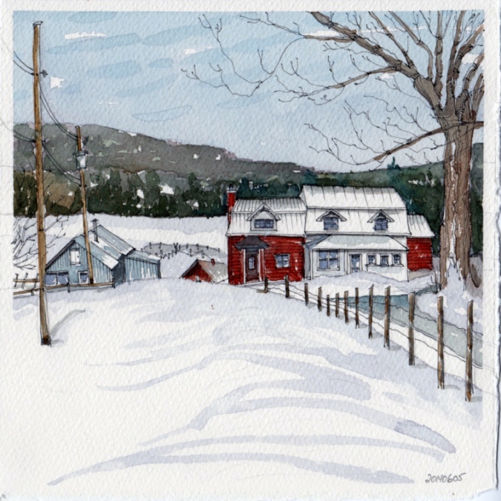
As I was painting this house, I suddenly realized that my brush was almost dry! And when you are painting in water colour, your brush is supposed to be wet? So this house was totally ruined by “dry-brushing” instead of water brushing (if that term exists). So looking down at my painting, I decided to put big blobs of water colour, invigorating the house as the water colours did their own thing -) So to me this is learning… the problem is that I often forget what I have learnt! I also wanted to mention that I have just received the Platinum Desk Pen EF DP1000AB which is the finest pen that I have ever owned… it is really nice and the ink flows freely.
Comme je peignais cette maison, je me suis soudain rendue compte que mon pinceau était presque à sec! Et quand vous peignez avec de l’aquarelle votre pinceau ne doit pas être sec, comme le mien était (le terme aqua est très clair? De l’eau?)! Il doit être chargé d’eau et de peinture. Donc, en regardant ma peinture, j’ai décidé de charger au maximum mon pinceau d’aquarelle, et de risquer de ruiner la maison — et j’ai laissé la peinture faire ce qu’elle doit faire. Avec de l’aquarelle, on doit laisser aller, pas essayer de contrôler le tout. Je suis fort contente d’avoir appris de quoi — le problème est que j’oublie souvent ce que j’apprends!!! Je voulais aussi mentionner que je viens de recevoir plume fontaine Platinum Pen EF DP1000AB qui est le stylo le plus fin que j’ai jamais possédé … il est vraiment sympa et l’encre coule à flot.
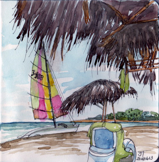
Paper: Handbook Travelogue Series, grand portrait size
Colours: Aureolin Yellow, Burnt Sienna, Alizarin Crimson & Cobalt Blue
Fountain Pen: Platinum Desk Pen EF DP1000AB
Ink: Noodlers’ Lexington Grey
Location: My mother’s home on the waterfront of beautiful Lake St. Francis, Valleyfield, Québec, Canada