I found I could say things with colors that I couldn’t say in any other way – things that I had no words for. – Georgia O’Keeffe
During Jane Blundell’s workshop this weekend, we drew and painted from a reference photo using different watercolour techniques. During the workshop I did not really kow where she was taking us, but she knew “exactly” what she was doing. Bravo Jane -)
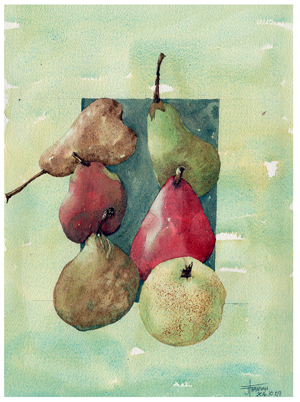
Techniques used: Toothbrush flecking, salt on wet canvas, watercolour pencil shavings dropped on wet pear, indenting with end of brush, dip pen brushed on with colour to create stem effects.
First we need to look at what we are painting and decide then if we need a warm or a cool blue… and onwards for the three primary colours. I then painted the background colour with Cerulean Blue (cool) and Q. Gold (warm) going over the six pears. I then “lifted” with a Scott Towel the bottom right pear in its entirety first (as it was the lightest one) and then lifted out the highlights from all of the other pears only.
The top left pear I used Goethite pigment first and then finished with Raw Umber as these are granulating pigments that will enhance the dots on the pear. One of the techniques was to use salt on a still wet pear (see pear at the bottom left–even though I forgot to add it in when it was time to), then the bottom right pear has three grated watercolour crayons dropped onto the wet pear.The top right pear we used an underlying green colour mix that we mixed ourselves and topped it with its shadow equivalent (adding red to the green mix), the middle pears I did with one application and the right middle and I could have taken the end of my brush while my pear was still wet to create dents in the pear and the right hand middle pear I had to wait until the pear dried fully before putting in the final crimson mixed with phthalo blue-green pigment. Fiew! I am amazed that I can still remember all of the steps without having to look in my notebook -) Was great fun and I would redo it in a jiffy!
She also spoke of the different water textures that we can expect… from directly from the tube, to butter, to coffee, to milk and then weak tea.
Paper: Arches Cold Press
Colours: Quinachridone Gold (DS), Goethite (DS), Pyrrol Crimson (DS), Burnt Sienna, Cerulean Blue (W&N), Raw Umber (DS), Viridian (DS).
Location: Centre communautaire de Lachine, Québec, Canada

Another thought: The most realistic pears of the six are the ones you directed the painting of most fully (IE were not just following cut and dry instructions). Of these the one which works best is your last (middle left) as it is most three dimensional as well as colored as some of the Small dessert pears might be. If you were to have run over part of its right lower edge with clear water on a clean brush to create a “lost edge” it would be even better.
Van Gogh did potatoes; aren’t we fortunate to have pears in all their variety and interest?
LikeLiked by 1 person
You are so right Holly — so many things to think about when we are painting? Good observation!
LikeLike
Reblogged this on The Magic Moments of Watercolor and commented:
Watercolor students read this!
And then try at least one or two of the techniques Jane describes here.
LikeLiked by 1 person
Thank you Jane!!! i will now have to try some of these techniques asap.
Please keep posting.
Holly
LikeLike
DS watercolour tube of Cereulan Blue PB 35 or DS Watercolor stick cereulan blue chromium PB 36 ?
Best
Elaine
LikeLiked by 1 person
Jane recommended the Cerulean Chromium and my supplier was out of stock so I have the other one.
LikeLike
Tubes not sticks -)
LikeLike