“Art actually happens somewhere in the space between clarity and ambiguity, concept and intuition, thought and feeling.”
― Bert Dodson, Keys to Drawing
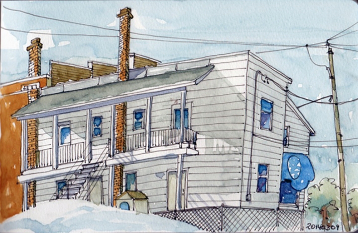
I have been pondering on the quality of shadows and how to paint them and one of my Belgian WordPress friends came to the rescue. She did a bit of research and found that to have an acceptable colour for the shadows, in principle we mix three colours: the darkest shadow tone of the object with its complementary and some blue. I tried it today and she is right! Yeah! I am very happy as I have been struggling with my shadow colours. Merci Christine! This apartment building stands on the rue Champlain in front of Jamunik in Valleyfield and it was a beautiful spring day today — finally starting to get warmer.
Ça fait des lunes que j’ai de la misère à trouver la bonne couleur pour mes ombres et une de mes amies WordPress de la Belgique est venue à mon secours. Pour obtenir une couleur correcte de l’ombre on mélange en principe 3 couleurs : la tonalité la plus sombre de l’objet, sa complémentaire et du bleu. Et ça l’a fonctionné Christine — merci -) Ce bloc appartements est situé sur la rue Champlain, just en face de la Librairie Jamunik à Valleyfield. C’était une superbe journée de printemps aujourd’hui — finalement le temps se réchauffe -)
Paper: Handbook Travelogue Sketchbook
Colours: Q. Gold, Q. Deep Gold, Alizarin Crimson & Cobalt Blue
Fountain Pen: Pilot Prera F
Ink: Noodlers Lexington Grey