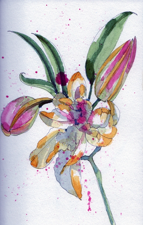
My husband bought me some beautiful tiger lilies that smell like heaven. So I decided to paint them… I have been painting flowers for the past two weeks and have not posted them as they were just too awful to post :) The first painting that I did I decided NOT to mix any colours and use all of the colours that I saw. New Gambodge, Rose Madder Genuine, Serpentine Green, Sap Green, Vivianite and French Ultramarine. This represents a cacophony of colours and even though the painting is interesting, there is nothing that is holding it together–linking it.
Voici la première peinture que j’ai peint avec beaucoup de couleurs différentes… en fait, j’ai utilisé 6 couleurs. New Gambodge, Rose Madder Genuine, Serpentine Green, Sap Green Vivianite et French Ultramarine.
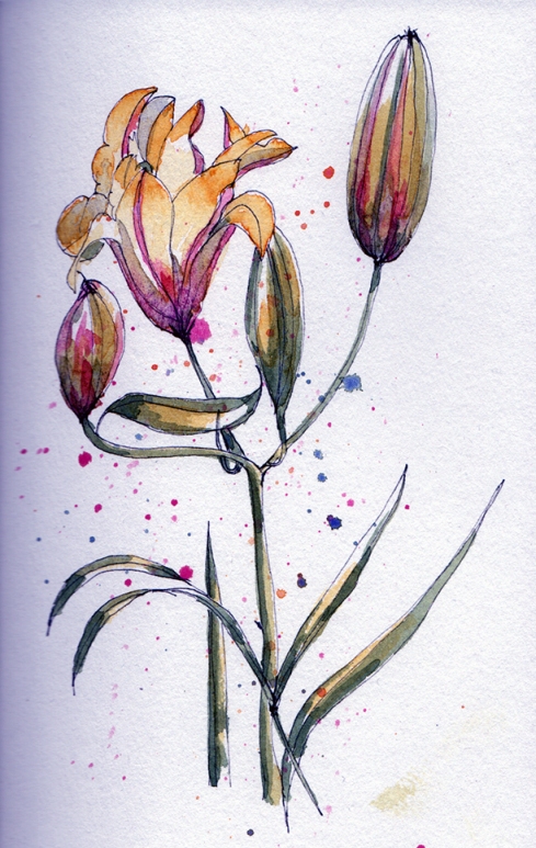
However, when you look at my second painting I only used three colours… Rose Madder Genuine, French Ultramarine and New Gambodge. I created the greens mixing the FU and NG together, I created the oranges with NG and RMG and the grey was made with all three colours. The painting has a sense of softness and of being held together because the colours are linked to each other.
Par contre, cette 2e peinture je n’ai utilisé que trois couleurs primaires (jaune, rouge et bleu). Les voici… New Gambodge, French Ultramarine et Rose Madder Genuine. Avec ces 3 couleurs primaires, j’ai mélangé pour créer les verts, gris, mauves, etc. Ne trouvez-vous pas que ces couleurs lient la peinture ensemble? Qu’elles appartiennent et unissent la peinture ensemble?
Which one do you prefer?
Pen: Pilot FlexiGrip, EF
Ink: Noodlers Lexington Gray
Paper: The Colours of Water Sketchbook from the Montreal Museum of Fine Arts

Les deux sont vraiment très jolies.j’aime beaucoup ce graphisme.
LikeLike
Merci A.G…. !
LikeLike
I couldn’t possibly pick one over the other. I really like the composition of the first one — it really suits the explosion of colour. Having said that, I’m a big fan of mixing colours to unify a painting too. They’re both lovely.
LikeLike
Hi Anna,
Thank you for your comment… It is really interesting to know! I was so sure that everyone one would prefer the limited palette ;-) just to show that I do not know how people perceive colours — LOL —
LikeLike
I can’t say that I prefer one over the other. They are both lovely in their own right. The top one feels more joyous and the second one a bit tentative (but, in a good way).
LikeLike
Hi Anita,
Thank you for your comment! It is true that the first one was more spontaneous and the second one was more studied — you have a good eye ;-)
LikeLike